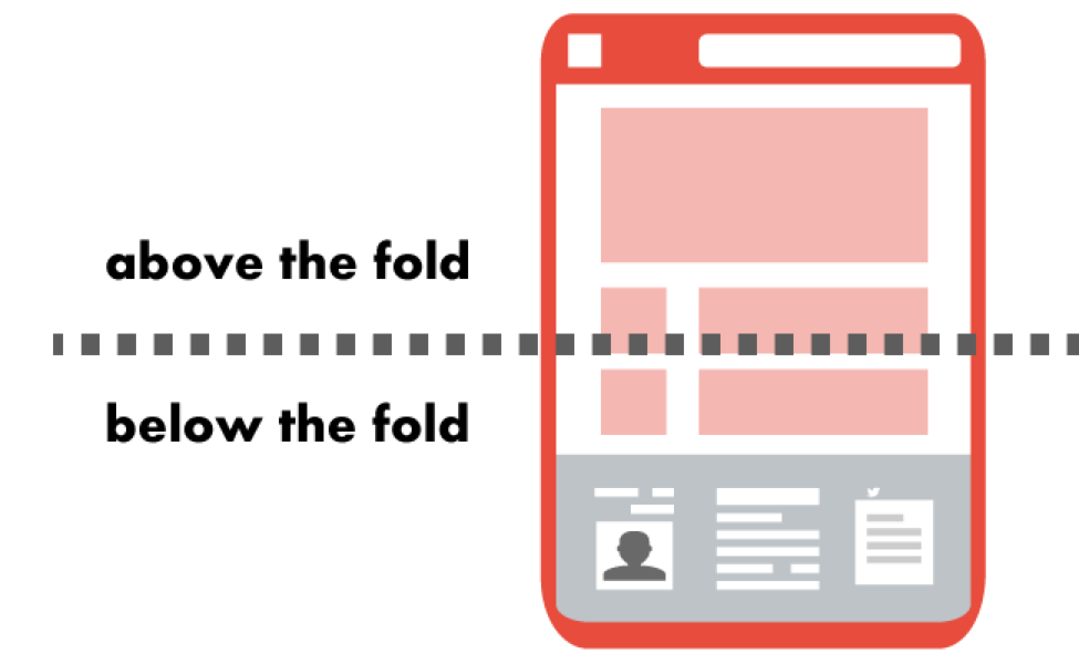
Above the fold (ATF) refers to the upper portion of a webpage that appears in a user’s browser window before scrolling. This area is considered the most visible and valuable portion of the webpage, as it is the first thing visitors see when they land on a website. The ATF section allows web designers to highlight key features and benefits, create an engaging and effective user experience, and increase website conversions. Optimizing the above the fold area ensures visitors stay longer on the website and increases the rate at which they take action.

Origins of Above the Fold
The concept of “above the fold” first emerged in the early days of newspaper publishing. The ATF was the topmost part of the front page visible on folded newspapers. The section was easily visible on a newsstand or the porch after the delivery of the paper. It made it easier to lure readers with attractive headlines, visuals, and stories as they quickly caught their attention.
The concept became crucial for web page design. The main purpose was to showcase key information and visuals at first glance, inducing users to look further into a website or blog. The above the fold area lets website owners direct users’ attention to their most important content and features. Nowadays, the concept of user experience is central to web design, and the ATF section plays an important role in enhancing the user experiences on the website.
Primary Features of the ATF Area
Although every ATF section varies from website to website, there are some core features that they should all have. Some key features of the ATF section include the following:
Captivating headline
The headline of an ATF area should be concise, captivating, and unique. It should capture readers’ attention immediately, while conveying a sense of curiosity that compels them to read further. It reflects the page’s main theme and is relevant to the target audience. The headline should be short enough to fit within the limitations of the section. This is to ensure it does not take away from the other elements of the page, such as images or graphics. When crafting an effective headline, it is important to use the target audience’s language, using relevant words and phrases that resonate with readers.
Eye-catching images or visuals
The ATF area should have visuals that capture the viewer’s attention. This includes pictures, videos, infographics, icons, and other forms of visual media. Images should be relevant to the content and high-quality to stand out. Videos should be concise, professionally produced, and relevant to the topic. Infographics should be well-designed, easy to read, and informative. Icons can effectively guide readers to the right information or action. The visuals incorporated into the ATF area create a compelling experience for viewers that goes beyond the written content.
Clear call to action (CTA) buttons
These provide a clear and simple way for users to take the desired action. They contain texts like “Sign Up Now,” “Order Now,” or “Learn More.” CTA buttons help visitors navigate your website and take the necessary steps to complete their objectives. The buttons incorporate colors that stand out against your website’s background, ensuring visitors can spot them easily. The CTA buttons in the ATF area increase conversion rates as they draw attention to the action you want visitors to take.
Short, concise copy that grabs attention
This consists of short written text placed below the headline in the ATF section. It should be sharp and thought-provoking, creating interest in readers and prompting them to learn more about the information presented. It mostly elaborates on the headline and introduces the reader to the concept or topic of discussion. This copy should be interesting enough to hold readers’ attention while being brief and concise.
Brand logo
This is mostly the company logo, usually placed at the top of a website page. This logo helps identify the company on its website and promotes brand identification.
Navigation bar
The navigation bar helps users quickly and conveniently access different website sections. It contains links that direct visitors to important pages and information, such as the homepage, contact page, and services offered.
Why Is It Important?
The ATF section has become increasingly important in today’s world. It is an effective way to ensure that the design of web pages makes focuses on creating impressions. Here are some key benefits of ATF:
- Capture and retain visitors’ attention: When visitors see a page that looks good, is well organized and contains relevant content presented enticingly, they are more likely to stay on the page and browse further.
- Make a strong first impression: Visitors’ first impression of a website is often determined by what they see on the above-the-fold portion. Having an attractive and inviting design can make the difference between a successful website and one that visitors quickly leave.
- Drive better conversions: CTA on the ATF area, encourage visitor to take the desired action more effectively. This leads to more conversions, which is beneficial for businesses.
- Increase user experience: Pages with well-designed ATF areas are more attractive to visitors and offer a better user experience. This is because they enable users to easily find relevant content and better understand the website.
- Enhance brand identity: A well-designed ATF section also helps build a brand identity. By utilizing fonts, colors, and other elements unique to the website, visitors are more likely to recognize it, whether they are coming for the first time or returning.

🔗DOWNLOAD: 10 ChatGPT SEO Prompts to 10X Your Output
Incorporate generative AI into your SEO workflows to save time, get better output, and drive more organic results. Get this Ebook now to copy-and-paste our best prompts!
