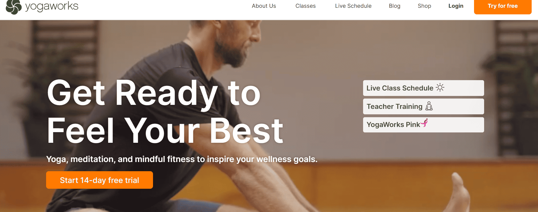
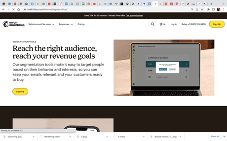
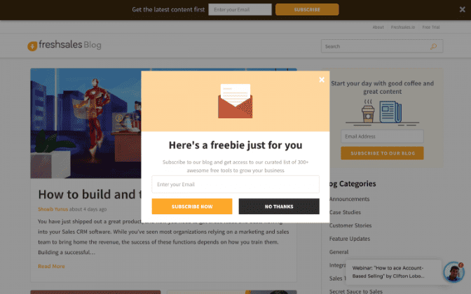
Statistically 9 out of 10 website visitors who read your headline also read your call to action (CTA) copy. This means a well-crafted CTA button has the potential to land you up to a 90% conversion rate!
If you’re ready to boost your conversion rates, review our list of 16 powerful call-to-action examples that will have your audience running to click, sign up and buy.
Table of Contents:
- What is a call to action (CTA)?
- Crafting an Effective CTA for Social Media and Beyond
- 16 Best Practices for Creating Effective Call-to-Actions
- 1. Make it Concise and Clear
- 2. Use Actionable Language
- 3. Align CTA Copy with Landing Page Copy
- 4. Include a Clear Value Proposition
- 5. Give a Reason
- 6. Use Commanding Language
- 7. Create a Sense of Urgency
- 8. Make it Visually Appealing
- 9. Use White Space
- 11. Test Different Variations
- 12. Use Social Proof
- 13. Personalize When Possible
- 14. Offer Incentives
- 15. Use Persuasive Language
- 16. Place CTAs Strategically
- Final Thoughts
What is a call to action (CTA)?
A call to action is a prompt encouraging a user or reader to take a specific action. Essentially, CTAs are the bridges that connect user interest to user action. The action you want people to take can be anything from purchasing a product to signing up for a newsletter.
It’s like saying “Here’s something we know you’ll love. Why not give it a try?” This can turn a casual visitor into a loyal customer and make a real difference in your bottom line.
CTAs can come in a variety of forms, each with its specific uses and advantages. For instance:
- Text links are often used within blog posts or articles to guide readers to related content or offerings.
- Buttons, on the other hand, are more visually striking and are typically used on websites or in emails to draw attention to primary actions, such as “Buy Now” or “Sign Up.”
- Plain text CTAs are commonly seen in social media posts or emails where hyperlinking isn’t possible or desired.
Free Ebook: How Marketers Can Build and Track Landing Pages that Convert
The only guide you need to design, build, track, and test landing pages. Learn to instantly boost conversion rates with proven tactics following a simple blueprint.
CTAs can be simple, like “Learn More” or “Shop Now,” which gives a clear, direct action for users to take. They can also be extended, offering more detail or persuasion, such as “Get your free e-book now and start learning today!”
Instagram, for instance, has the call to action “Swipe Up” in stories, encouraging users to explore more content. Email campaigns often use CTA examples like “Click Here for 20% Off Your First Order,” which not only prompts action but also offers a tangible benefit.
Landing pages commonly use compelling CTA buttons like “Start Your Free Trial Today.”
Crafting an Effective CTA for Social Media and Beyond
The cornerstones of successful CTAs are strong action words and verbs. These powerful words command attention and create a sense of immediacy, urging users into taking the desired action.
CTA examples like “Discover,” “Start,” “Join,” and “Buy” are commanding and clear. They leave no doubt about what the user should do next.
A great CTA also matches the purpose and offering of your business. For instance, if you run an online clothing store, “Shop the Latest Collection Now” might be your go-to CTA. A skincare clinic can use “Book Your Free Consultation Today.”
When you properly clarify the action and benefit, you ensure your CTA resonates with your audience and also aligns with your business offerings.
One effective framework for creating CTAs is the LIFT Model. LIFT stands for Landing page Influence Function for Tests.
It identifies six factors that can impact your conversion rates:
- Value Proposition
- Relevance
- Clarity
- Urgency
- Distraction
- Anxiety
Applying these factors when designing your CTAs can help you create more impactful and effective prompts.
This simple table showcases the most common CTA examples based on intention:
| Intention | Most Common CTAs |
| E-commerce Purchase | Buy Now, Add to Cart, Shop Now |
| Newsletter Subscription | Subscribe Now, Join our Mailing List |
| Service Consultation | Book a Free Consultation, Schedule a Call |
| Content Download | Download Now, Get Your Free E-Book |
| Event Registration | Sign Up Now, Reserve Your Spot |
16 Best Practices for Creating Effective Call-to-Actions
Creating effective call-to-actions (CTAs) is crucial for driving user engagement and achieving your desired outcomes. Here are 16 best practices to consider when creating CTAs:
1. Make it Concise and Clear
Just like you wouldn’t invite someone to “walk leisurely towards the entryway,” but would instead ask them to “come in,” the same logic applies to your CTAs. There’s an art to crafting a CTA that’s as clear as a mountain spring and as straightforward as a motorway.
The simple hack is to cut through the clutter and noise to make it simple for the user to understand the action to take. For instance, avoid making your CTA button overly elaborate. For example, instead of “Sign up and gain wisdom from our insightful newsletter,” use a better call to action example like “Subscribe to our newsletter.”

2. Use Actionable Language
Actionable language is your secret weapon when you’re drafting a persuasive CTA. It’s like an encouraging nudge or the enthusiastic ‘go for it’ your users need. When you tell your customers to “Buy now,” “Learn more,” or “Download now,” you’re not only giving them a clear path to follow, you’re also offering them a gentle push down that path. Think about the action you want your users to take, and put it right there in your CTA.

3. Align CTA Copy with Landing Page Copy
Imagine seeing a sign for “Fresh Apple Pie” outside a quaint cafe. You follow the sign, the mouthwatering image of a warm apple pie already playing on your mind. But when you enter, you’re served chocolate cake. Good, but not what you were promised. That’s what it feels like when your CTA copy doesn’t align with the landing page copy. The journey from CTA to the landing page should be as smooth as a well-oiled machine, delivering exactly what was promised.

4. Include a Clear Value Proposition
An effective call to action (CTA) example is “Call today to schedule your free consultation!” This CTA clearly states the desired action (call today) and provides a compelling reason for users to take that action (a free consultation). By offering a valuable incentive, such as a consultation, you increase the chances of user engagement and conversion. Make sure to prominently display your CTA and provide clear instructions for users to take action. By implementing strong CTAs, you can drive user engagement and achieve your conversion goals
Similarly, your CTA should give your customers a clear indication of what they will get. “Get your free e-book now,” “Join for exclusive content,” and “Start your free trial” are all examples of CTAs that tell the customer what’s in it for them.

5. Give a Reason
Why should someone follow your CTA? Because you’re going to give them a reason they can’t refuse. A good call to action example highlights the benefits the user will receive and nudges them in the right direction. For instance, take a simple CTA button like “Subscribe Now.” Now add a reason to it: “Subscribe now and get a free 30-day trial.” With the added incentive, you’re offering users something valuable—access to your services for free for a month.

6. Use Commanding Language
When you need to direct someone, you don’t use suggestions. You use commands. Similarly, when drafting your CTAs, a commanding tone can make all the difference. When you use phrases like “Buy now,” “Sign up today,” and “Order here,” you’re effectively commanding users to perform the action. This is not an excuse to be impolite, but instead assertive and direct. It’s about stating clearly what you want the user to do.

7. Create a Sense of Urgency
A good CTA example is creating a sense of urgency in the mind of your audience. CTA propels your audience to act sooner rather than later.
Call-to-action examples like “Limited Time Offer” or “Sale Ends Tonight” prompt immediate action by invoking a fear of missing out. Imagine you’re shopping online and you see a CTA saying “Buy Now! Only 3 left in stock.” That scarcity and time limitation would likely encourage you to make a purchase more quickly than you might have otherwise.

8. Make it Visually Appealing
The aesthetics of your CTA play a significant role in drawing attention and driving action. This doesn’t just mean using flashy colors or intricate designs. It creates a visual hierarchy on your webpage that leads the user’s eye toward the CTA.
Ensure your CTA button:
- Contrasts with the background color
- Is sufficiently large
- Is surrounded by enough white space to stand out

9. Use White Space
White space, or negative space, refers to the empty spaces around and between the elements of a design or layout. It acts like the punctuation in a sentence, giving your users time to breathe and absorb what they are seeing. When applied effectively, white space can emphasize your CTA, isolate it from other elements, and naturally draw your audience’s gaze towards it.

10. Optimize for Mobile Devices
With nearly 6.92 billion mobile users worldwide, your CTA must be mobile-friendly.
From the size and design of your CTA button to the loading speed of the landing page, every aspect should be optimized for mobile. Think about it: If a user has to squint to read your CTA or can’t easily tap the button, they’re likely to give up and your conversion opportunity will be lost.
11. Test Different Variations
What works for one business might not work for another, and even what works for you today might not work for you tomorrow. That’s where testing comes in. Trying out different CTA text, designs, placements, or even landing pages will help you learn more about your audience’s preferences and behavior. This practice, often known as A/B testing, can provide invaluable insights that help you refine your approach and maximize your conversion rates.
12. Use Social Proof
Ever noticed how you’re more likely to watch a movie or visit a restaurant if a friend recommends it? That’s social proof in action, and it’s just as powerful when applied to your CTAs. Social proof can take the form of customer testimonials, star ratings, or even the number of subscribers or customers you have. For instance, a CTA example like “Join 1 million satisfied customers. Subscribe Now!” leverages the influence of social proof. Seeing that others trust and value your product or service can help persuade potential customers to take the desired action.

13. Personalize When Possible
In a world where we are often swamped with generic advertising, a personalized touch can make your CTA shine like a beacon in the night. By tailoring your CTA to your user’s needs or behavior, you can increase the likelihood of them engaging with it.
Imagine browsing a travel site and seeing a CTA that says “Pack Your Bags, [Your Name]. Your Dream Holiday to Spain Awaits.” It’s personalized, relevant, and appealing, making it hard to resist.

14. Offer Incentives
Everyone loves a good deal, and your audience is likely no different. By offering an incentive, you can sweeten the deal and make your CTA more appealing. This could be a discount, free trial, exclusive content, or any other reward that your audience might find valuable. For example, a CTA like “Sign Up Now and Get a Free E-Book” gives your audience a compelling reason to act. But remember, the key is to offer something that your audience truly values, not just something that’s convenient for you to give.

15. Use Persuasive Language
The right words can convince, compel, and convert. When crafting your CTA, use language that resonates with your audience and speaks to their needs, desires, or concerns. It’s not about manipulating your audience, but about showing them how your product or service can make their lives better. For example, if you’re targeting a fitness-conscious audience, a CTA like “Start Your Journey to a Healthier You. Sign Up Today!” can be persuasive because it aligns with their goals and aspirations.

16. Place CTAs Strategically
Where your CTA is placed can be just as important as what it says. Ideally, your CTA should be positioned where it naturally fits within the user journey. This might be after an engaging piece of content, at the end of a product description, or even as part of a navigation menu. The key is to place your CTA where it is easily visible and where users are likely to be ready to take action. For instance, on a blog post, you might place a CTA to subscribe to your newsletter immediately after the conclusion, capitalizing on the engagement and interest generated by your content.

Final Thoughts
Creating an effective call to action requires both creativity and data-driven optimization. The key is crafting compelling, clear, and concise messages that resonate with your audience, offer value, create a sense of urgency, and other call-to-action examples as explored in this blog post.
With these best practices and call-to-action examples, you’re well-equipped to design CTAs that are engaging, compelling, and action-oriented.


